British Political DataA place to find data on Britain
HomeCensus MapGE Result MapMigrationPoliciesInfographics
Infographic

The Growth in British Net Immigration

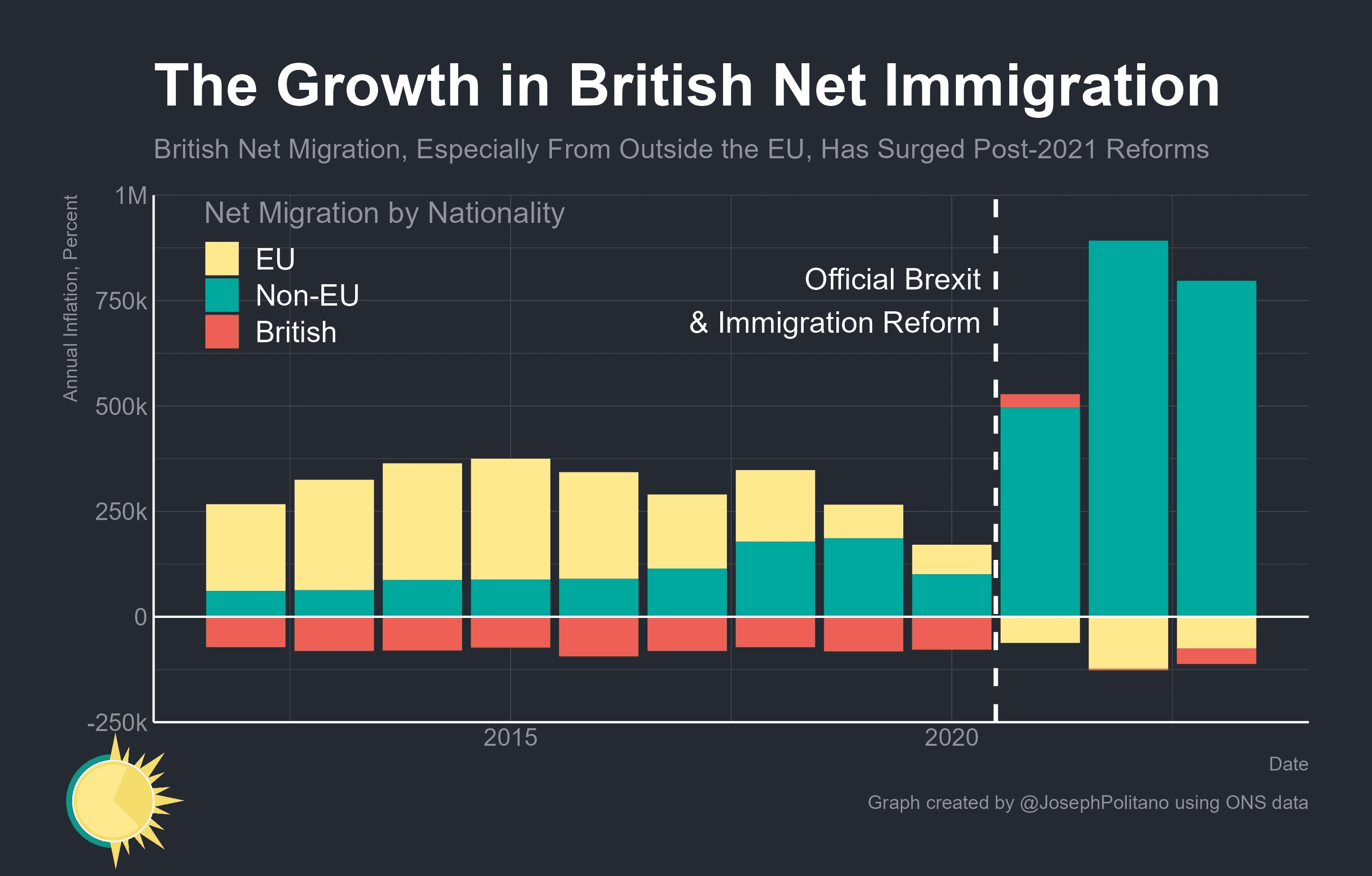
Chart of net migration by nationality showing the post-2021 rise in non-EU migration and the changing contribution of EU and British flows.

<- Back to infographics
Immigration

Full-size graphic

Open the image at full reading size with its source metadata preserved alongside the visual.

ImmigrationImmigration
Source@JosephPolitano on X / ONS
PeriodPost-2021 reform era
Stacked bar chart showing growth in British net immigration by British, EU, and non-EU nationality components
Related

More infographics

Jump back into nearby visuals from the same theme or tag cluster.

Line chart showing how taxes and benefits narrow the household income gap between ethnic groups in the UK in 2023/24
TaxEconomicsTaxImmigrationDemographics

How Taxes and Benefits Narrow the Income Gap Between Ethnic Groups

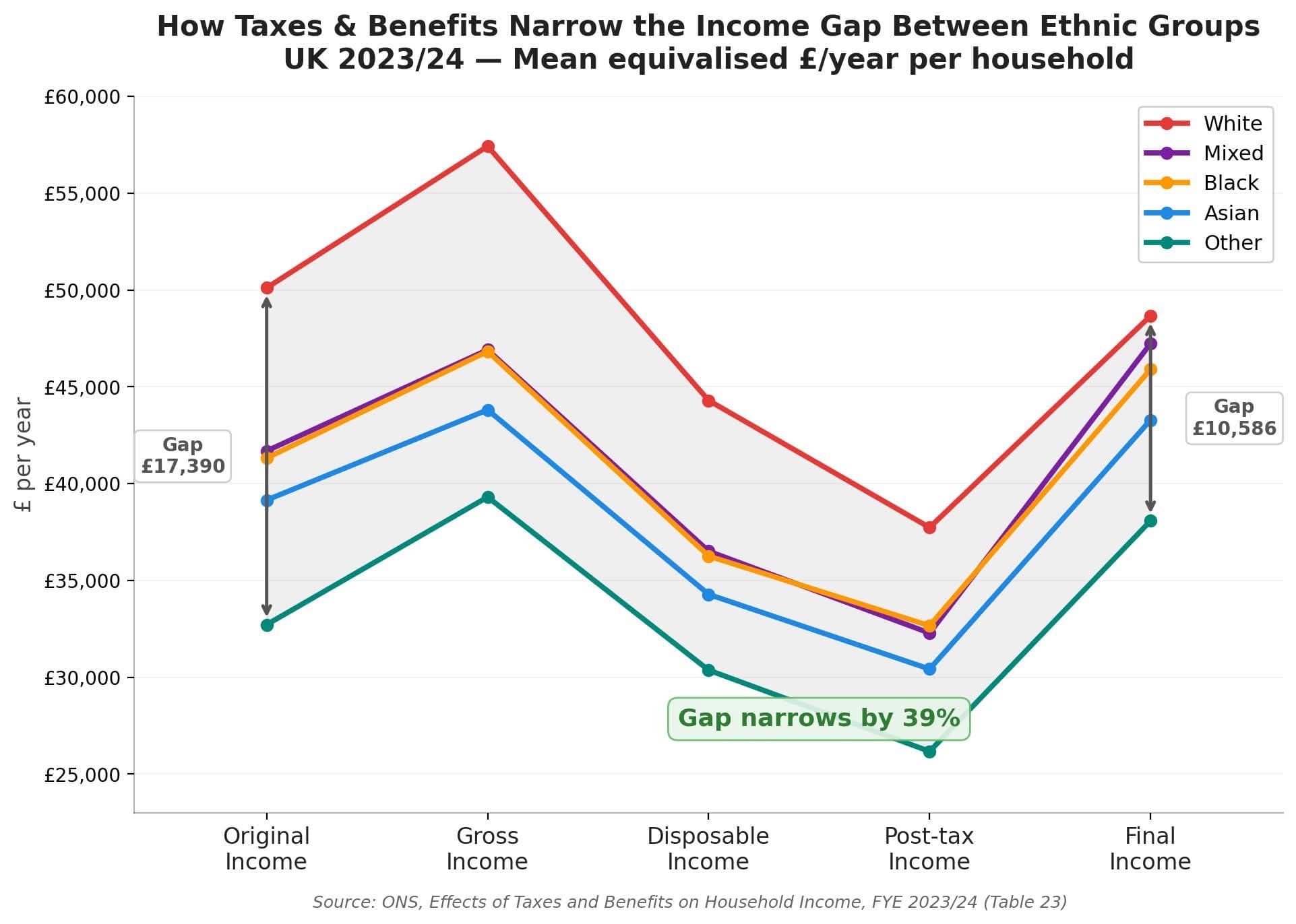
Visual explainer of how taxes and benefits compress post-tax and final-income gaps between ethnic groups, using ONS household income data for 2023/24.

Horizontal bar chart showing how taxes paid and benefits received combine by ethnic group in the UK in 2023/24
TaxEconomicsTaxImmigrationDemographics

How Taxes and Benefits Combine by Ethnic Group

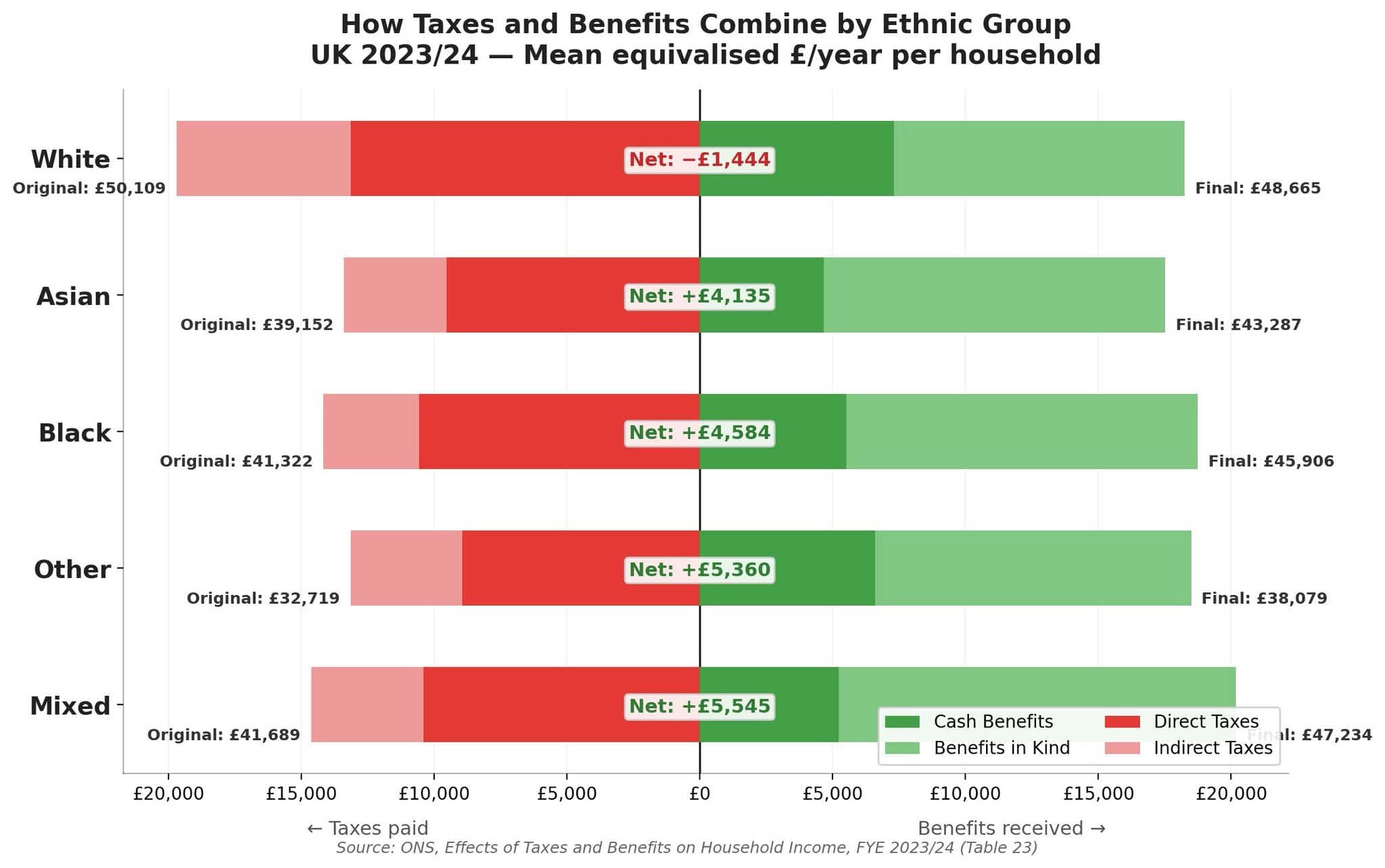
Breakdown of direct taxes, indirect taxes, cash benefits, and benefits in kind by ethnic group, showing the net effect on final household income in 2023/24.

Bar chart from CPS showing the proportion of household reference persons in social housing by country of birth in England and Wales (Census 2021). Somali-born residents have the highest rate at around 75%; UK-born is around 25%.
Social HousingSocial HousingImmigration

Social housing tenants by country of birth

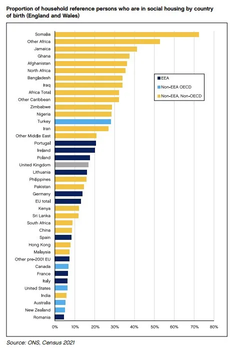
Proportion of household reference persons in social housing by country of birth. Somali-born residents have the highest rate (~75%), followed by Other Africa and Jamaica at ~55–60%; the UK-born rate is around 25%.