HousingHousingMigration
SourceCPS, How Many Homes Does the UK Need? (2025) · DLUHC · ONS
PeriodEngland, long-run series
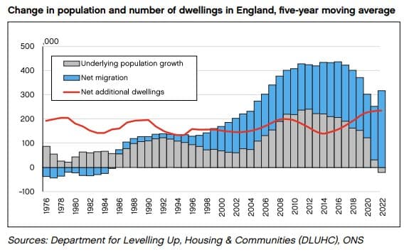
Net migration (blue bars) has driven population growth well above the rate of new dwelling construction (red line) since the mid-2000s.
Open the image at full reading size with its source metadata preserved alongside the visual.
Jump back into nearby visuals from the same theme or tag cluster.
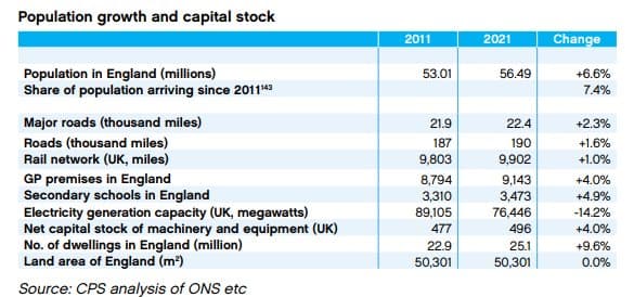
England's population grew 6.6% between 2011 and 2021, but infrastructure has not kept pace. GP premises grew 4.0%, secondary schools 4.9%, while electricity generation capacity fell 14.2%.
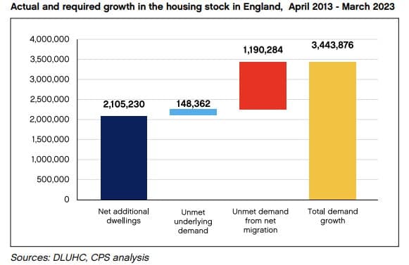
Of 3.4 million homes needed over the decade, only 2.1 million were built — leaving 1.3 million in unmet demand, predominantly driven by net migration.